How Colour Grading Shapes Emotion in Video
Colour influences how we feel before a single word is spoken. In video production, colour grading is more than an aesthetic choice. It shapes tone, mood, perception and emotion. Thoughtful colour grading can make your visuals feel warmer, more dramatic, more natural or more cinematic, depending on the story you want to tell.
Introduction
Every video has a colour language.
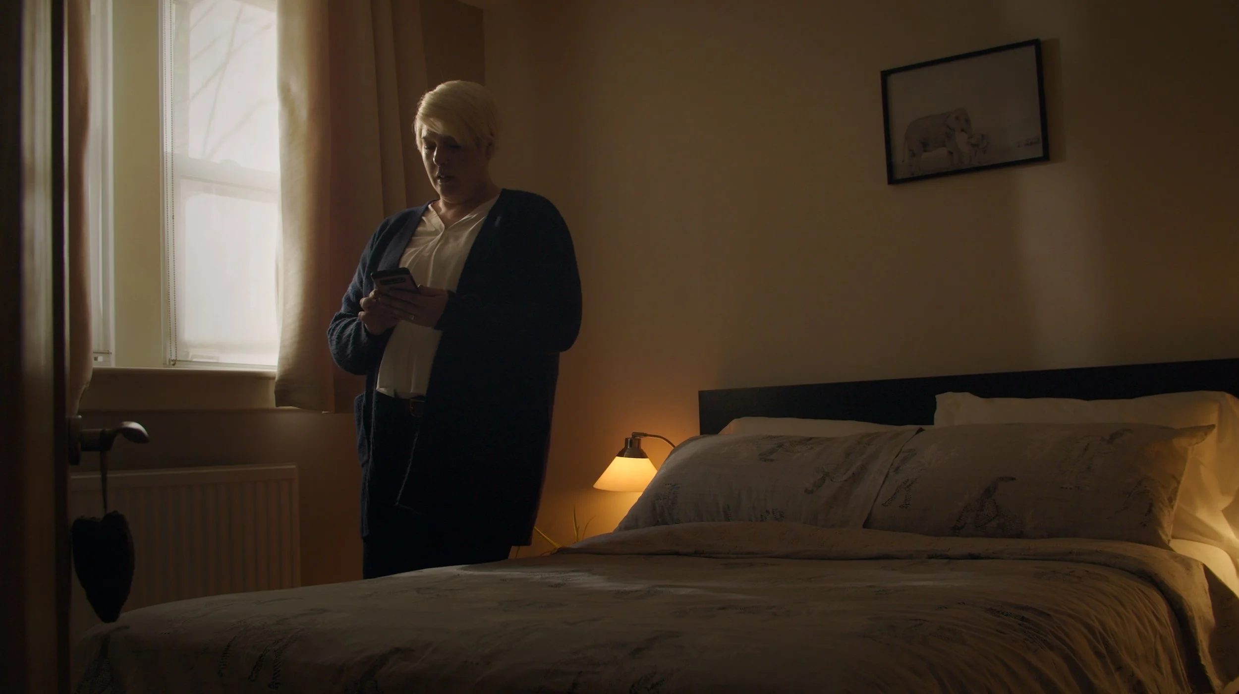
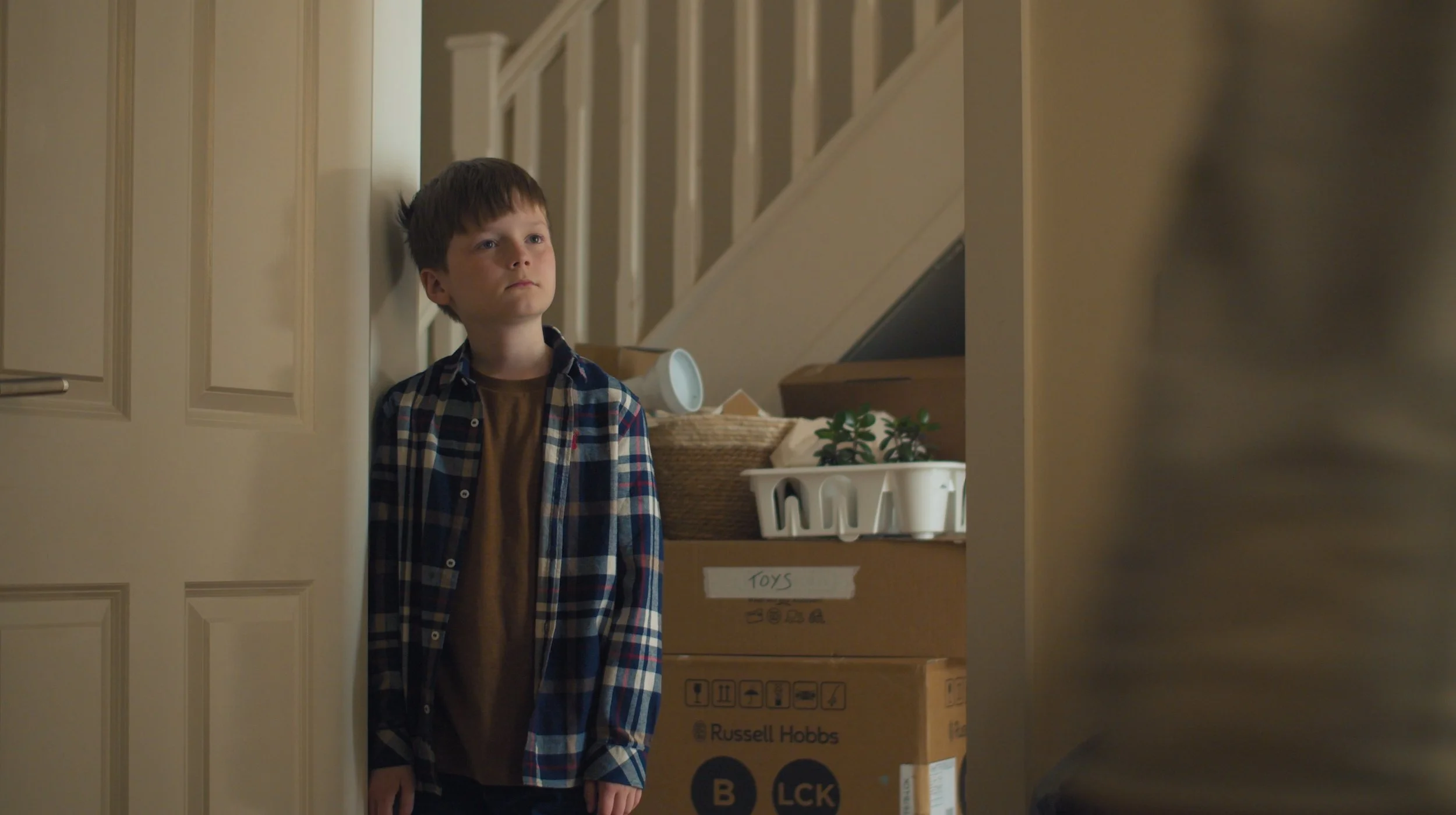
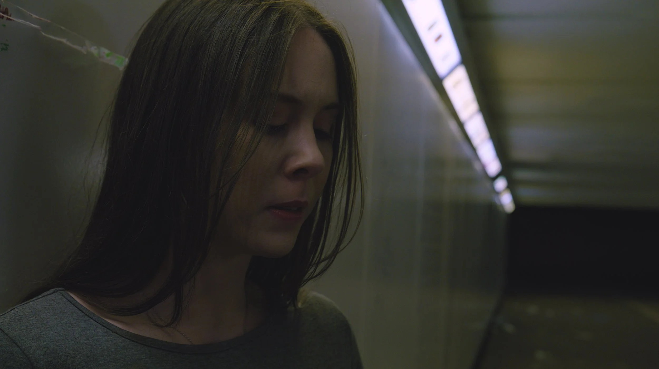
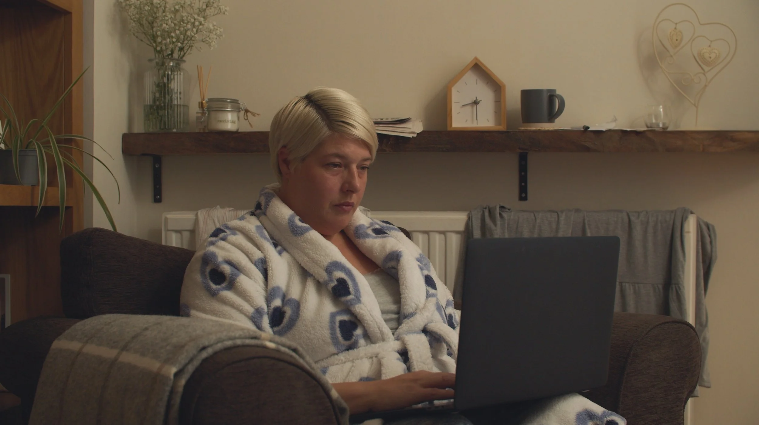
Before a viewer notices the script, the edit or even the subject, they feel the tone of the image. Warm golden light can create comfort and optimism. Cool blue shadows can suggest calm, distance or tension. Muted colours can feel serious and reflective, while rich contrast can make a story feel cinematic and bold.
That is why colour grading is more than a finishing touch.
In professional video production, colour helps shape emotion, guide attention and reinforce meaning. It brings consistency to a film, supports the story being told and helps your brand feel recognisable across every frame.
For businesses across Glasgow, Edinburgh and Scotland, thoughtful colour grading can be the difference between footage that simply looks good and a video that feels intentional, polished and emotionally engaging.
Colour and Emotion: The Psychology Behind the Palette
Colour influences how people interpret what they see.
Warm tones such as reds, oranges and yellows can create feelings of energy, warmth, confidence or urgency. Cooler tones such as blues, greens and greys can suggest calm, trust, professionalism or reflection. Softer, natural palettes often feel honest and human, while high-contrast colour can create drama and impact.
In video production, these choices are rarely accidental.
A recruitment film may use warm, natural colours to create a sense of belonging. A corporate film may lean into clean, balanced tones to communicate trust and clarity. A brand story may use richer colours to make the film feel more emotional, cinematic and memorable.
The goal is not to force an emotion onto the viewer. It is to support the feeling already present in the story.
When colour, message and performance work together, the video feels more cohesive. The audience may not consciously think about the grade, but they understand the mood it creates.
Colour Grading Is More Than a Finishing Touch
Many people think colour grading happens at the end of a project.
Technically, it does happen in post-production, but creatively, colour should be considered from the beginning. The final grade is influenced by lighting, locations, wardrobe, set design, camera settings and the overall creative direction of the shoot.
A strong colour grade does several things at once.
It balances exposure, contrast and saturation. It makes shots from different locations or times of day feel consistent. It enhances skin tones, protects detail and gives the final video a polished visual identity.
More importantly, it helps the story feel deliberate.
Without grading, footage can feel flat, mismatched or unfinished. With careful grading, every scene feels connected. The video gains depth, rhythm and atmosphere, allowing the audience to stay immersed in the message rather than noticing visual inconsistencies.
For corporate and branded content, this matters. Your video does not need to look exaggerated or overly stylised, but it should feel controlled, professional and aligned with your brand.
Colour as a Brand Language
Every brand already has a visual identity.
Your logo, website, photography, typography and colour palette all shape how people recognise and remember you. Video should extend that identity, not sit apart from it.
Colour grading helps bring your brand into motion.
A healthcare organisation might benefit from soft, natural tones that communicate warmth, reassurance and care. A technology company may prefer cleaner, cooler tones that suggest precision and innovation. A charity or social enterprise may want colours that feel human, grounded and emotionally honest.
These decisions affect perception.
When colour choices match your wider brand identity, your video feels more coherent. It looks like part of the same world as your website, social content, photography and printed materials. That consistency builds recognition and trust over time. For businesses investing in video production, colour should not be treated as decoration. It is part of how your brand speaks.
Setting Tone and Atmosphere
Colour grading helps define the atmosphere of a film.
A bright, airy grade can make a scene feel open, optimistic and approachable. A darker, more contrast-heavy grade can create intensity, focus or emotional weight. A soft, muted palette can feel reflective and intimate, while richer colour can add energy and confidence.
This is especially important in storytelling-led video.
The same interview can feel very different depending on how it is graded. A warm, natural finish may make the subject feel open and relatable. A cooler, more restrained grade may make the piece feel serious and considered. Neither is automatically better; the right choice depends on the story.
That is why colour grading should always serve the message.
If the video is about trust, the grade should not feel harsh or distracting. If the video is about innovation, it may need a cleaner, more modern visual style. If the video is emotional, the colour should support that feeling without becoming heavy-handed. Good grading does not just make footage attractive. It makes the tone clearer.
Guiding Attention Through Colour
Colour also helps guide the viewer’s eye.
In a busy frame, small adjustments to contrast, brightness and saturation can subtly direct attention towards the subject. Skin tones can be protected. Backgrounds can be softened. Distracting colours can be reduced so the most important part of the image remains clear.
This is one of the quieter strengths of professional colour work.
Viewers should not feel like they are being pushed around the frame, but they should instinctively know where to look. The grade helps create that visual hierarchy.
In corporate videos, interviews, case studies and promotional films, clarity is essential. You want the viewer focused on the person, product, message or moment that matters most. Colour grading supports that focus while keeping the film visually natural. The best colour work often goes unnoticed because it simply feels right.
Cultural and Contextual Meanings of Colour
Colour can carry different meanings depending on context.
Red may suggest passion, energy or urgency in one setting, but caution or danger in another. Green might communicate growth, calm or sustainability, but it can also carry different associations depending on the industry or audience. White may feel clean and minimal in one context, but cold or empty in another.
This is why colour choices need thought.
For local campaigns, brand films or internal communications, the emotional tone may be fairly specific. For national or international campaigns, the palette may need to work across wider audiences and cultural expectations.
A thoughtful production process considers these nuances. The aim is not to overcomplicate the grade, but to make sure colour supports the message rather than confusing it. When handled well, colour creates emotional clarity while still feeling authentic to the brand.
Consistency Across Platforms
Your video may be watched in many different places.
It could appear on your website, LinkedIn, Instagram, YouTube, in a presentation, at an event or on a mobile phone. Each platform, screen and environment can change how colours appear.
Consistent colour grading helps protect your visual identity across those different uses.
It ensures your videos feel connected, even when they are cut into different formats or used across multiple campaigns. A main brand film, social snippets, testimonial edits and website banners should all feel like they belong to the same visual world.
That consistency matters for recognition.
When audiences see your content repeatedly, the look and feel becomes familiar. Over time, that familiarity builds trust. Your video content becomes part of your brand identity rather than a collection of unrelated assets.
Subtlety Is Often Stronger Than Excess
Good colour grading does not have to be extreme.
Not every video needs a dramatic cinematic look, heavy contrast or obvious colour styling. In many corporate and branded projects, subtle grading is more effective because it keeps the focus on authenticity.
The aim is to enhance, not overpower.
Skin should look natural. Locations should feel believable. The brand should feel polished without appearing artificial. A careful grade brings out the best in the footage while preserving the honesty of the moment.
This is especially important for interviews, documentaries, educational films and human-led brand stories.
If the grade feels too stylised, it can create distance between the viewer and the subject. If it is too flat, the film can feel unfinished. The best result usually sits in the middle: considered, expressive and emotionally clear.
Conclusion
Colour grading is one of the most powerful tools in video storytelling.
It shapes mood, builds atmosphere, guides attention and strengthens brand identity. It helps viewers feel the message, not just understand it. When used with care, colour turns individual shots into a cohesive visual experience that feels polished, purposeful and memorable.
For businesses across Glasgow, Edinburgh and Scotland, professional colour grading can elevate corporate films, promotional videos, interviews, brand stories and social content. It ensures every frame feels consistent with your message, your audience and your brand.
At Reverie Films, we approach colour with intention. Every grade is designed to support the story, protect authenticity and create a visual tone that feels right for the project. Whether your film needs warmth, clarity, energy or emotional depth, colour helps bring that feeling to life.