The Psychology of Colour: How Colour Grading Shapes Emotion in Video
Colour influences how we feel before a single word is spoken. In video production, colour grading is more than an aesthetic choice; it’s a psychological tool that shapes perception and emotion. Here’s how thoughtful colour grading can transform your visuals and deepen the emotional connection with your audience.
Introduction
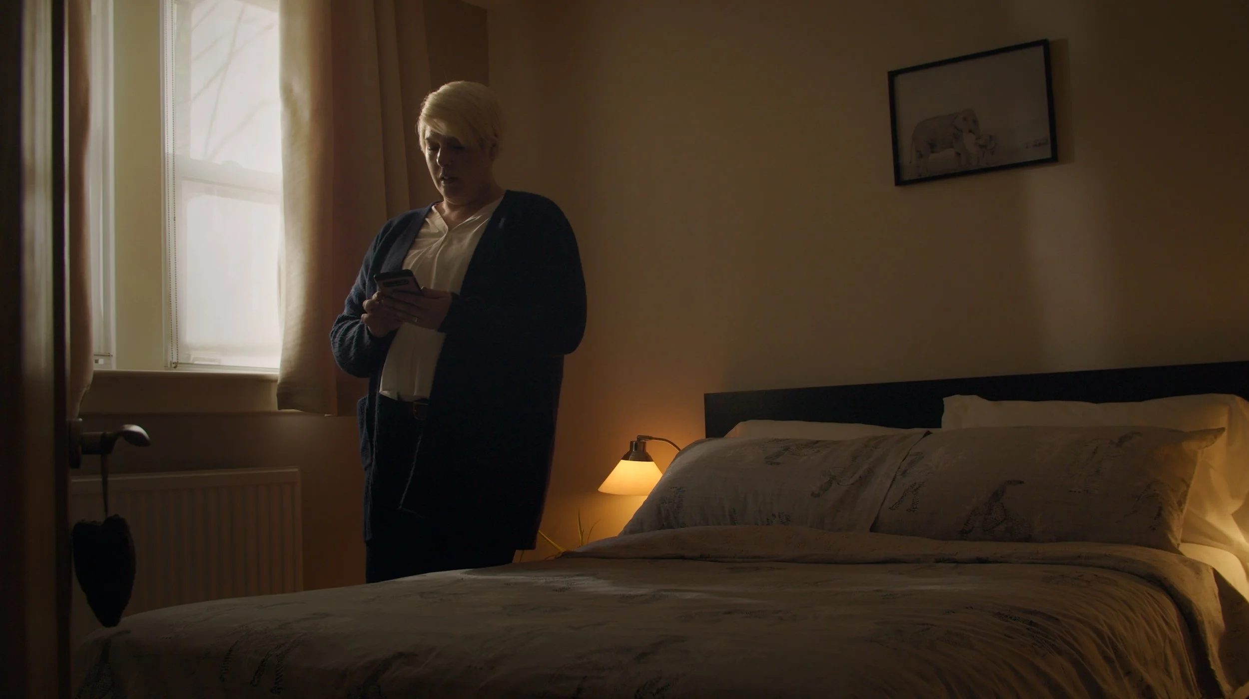
Every shade in a video carries emotional weight. From the warmth of golden tones to the chill of desaturated blues, colour grading subtly guides how viewers interpret a story. It’s not just about making footage look cinematic, but about shaping mood, atmosphere, and emotional impact.
In professional video production in Glasgow and across Scotland, colour plays a vital storytelling role. It unites visuals, tone, and message into a cohesive whole. Whether the goal is to inspire, reassure, or energise, the right palette creates an instant emotional response, one that lingers long after the final frame fades.
Colour and Emotion: The Psychology Behind the Palette
Colours influence perception on a deeply instinctive level. Warm hues such as reds and oranges create energy, passion, or urgency, while cooler tones like blues and greens evoke calm, trust, or reflection.
In visual storytelling, understanding this psychology allows creators to reinforce emotion through subtle cues. A corporate brand video might use blues and neutrals to communicate professionalism, while a lifestyle campaign might lean on golden highlights for warmth and approachability.
At Reverie Films, our colour work begins with intention; every shade supports the narrative. To see how we blend artistry and psychology across projects, visit our portfolio.
The Art of Colour Grading: More Than a Finishing Touch
Many assume colour grading happens at the very end, but it’s far more integral. It’s the process that refines tone, texture, and emotion, ensuring every shot feels unified and expressive.
Grading adjusts exposure, contrast, and saturation to achieve balance while enhancing mood and storytelling. The difference between a flat image and a graded one can be dramatic; subtle adjustments can make footage feel more cinematic, polished, and emotionally cohesive.
In corporate and branded content video production, this stage often determines how professional your final film looks. It’s where visuals gain their final sense of depth, identity, and purpose, elevating your story from simply seen to truly felt.
Colour as a Brand Language
Every brand has a visual identity, and colour grading helps extend that identity into motion. Matching tones to brand colours, values, and emotional goals ensures consistency across campaigns and platforms.
For example, a healthcare organisation might prioritise soft, natural tones that evoke care and calm, while a tech brand may opt for cooler contrasts to communicate precision and innovation. These choices go beyond preference, they influence trust and perception.
When working with a video production company in Glasgow, aligning your colour palette with your brand values helps create a cohesive visual world that feels intentional, professional, and distinctly yours. Our services include colour grading as part of a holistic storytelling process.
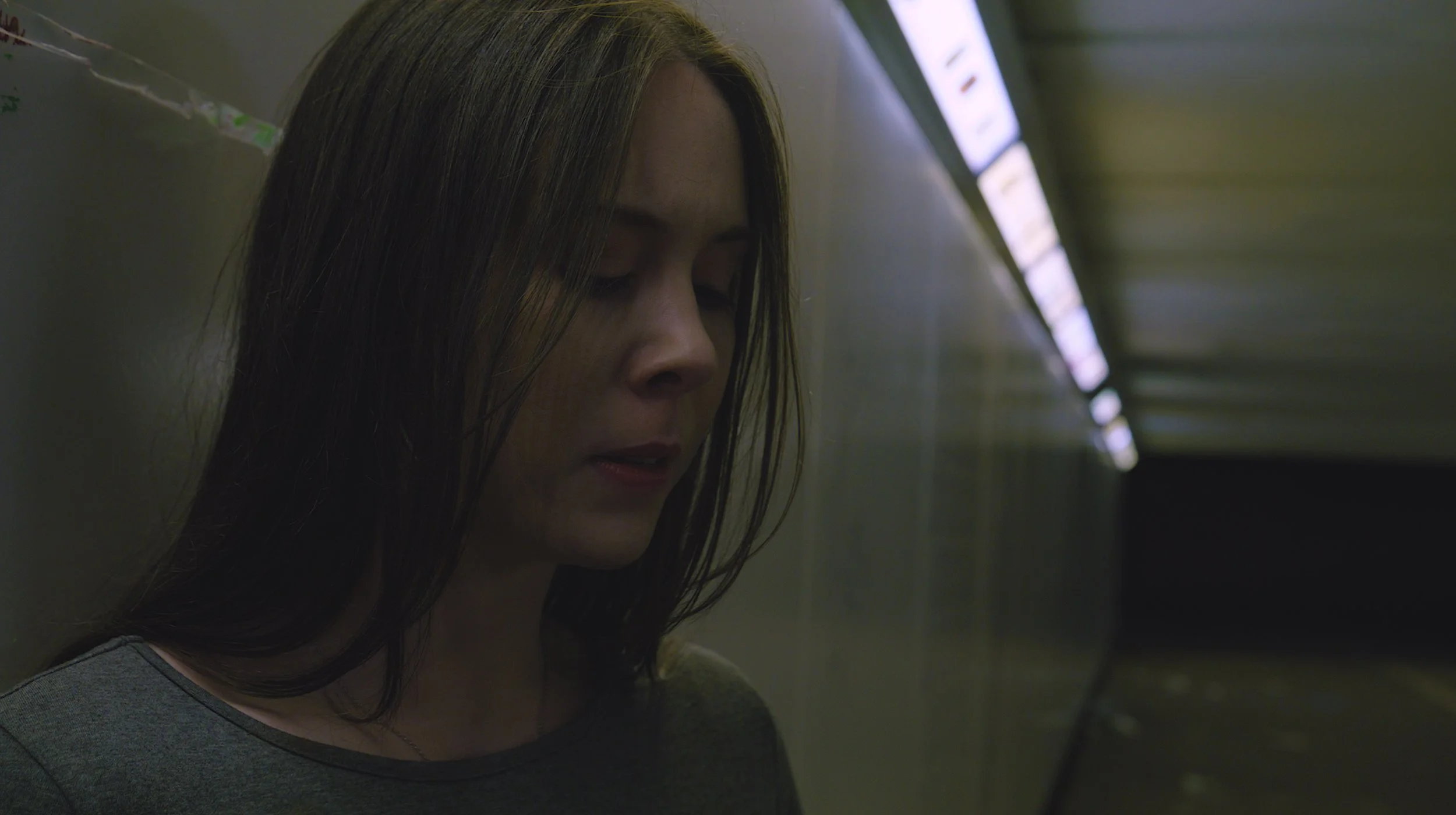
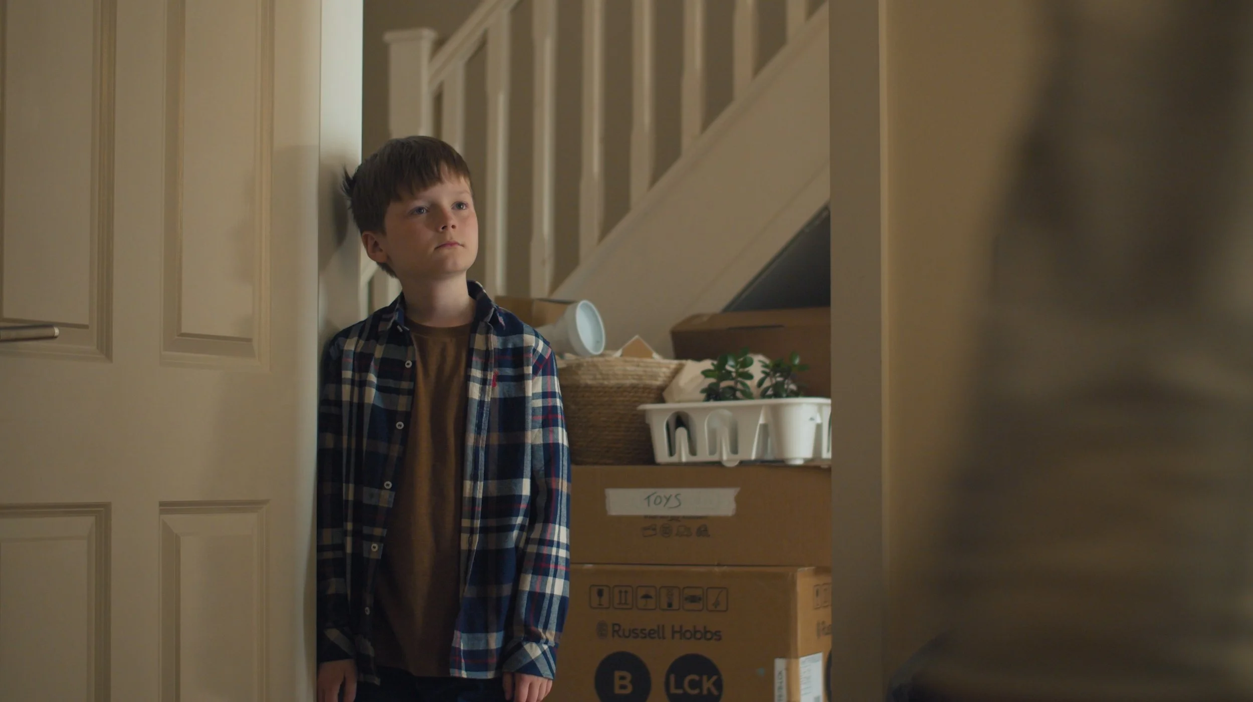
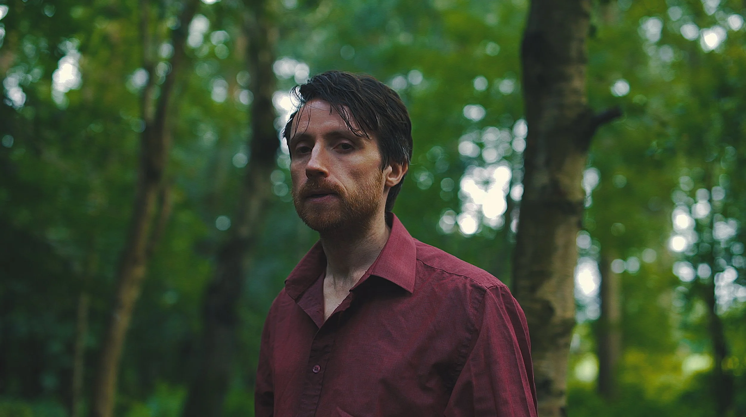
Setting Tone and Atmosphere
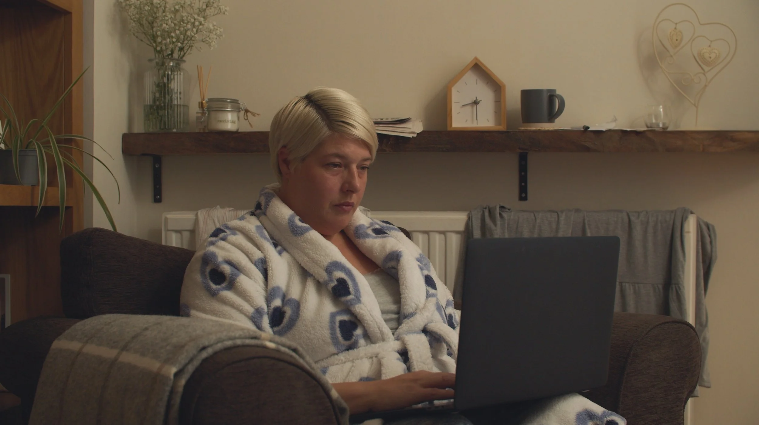
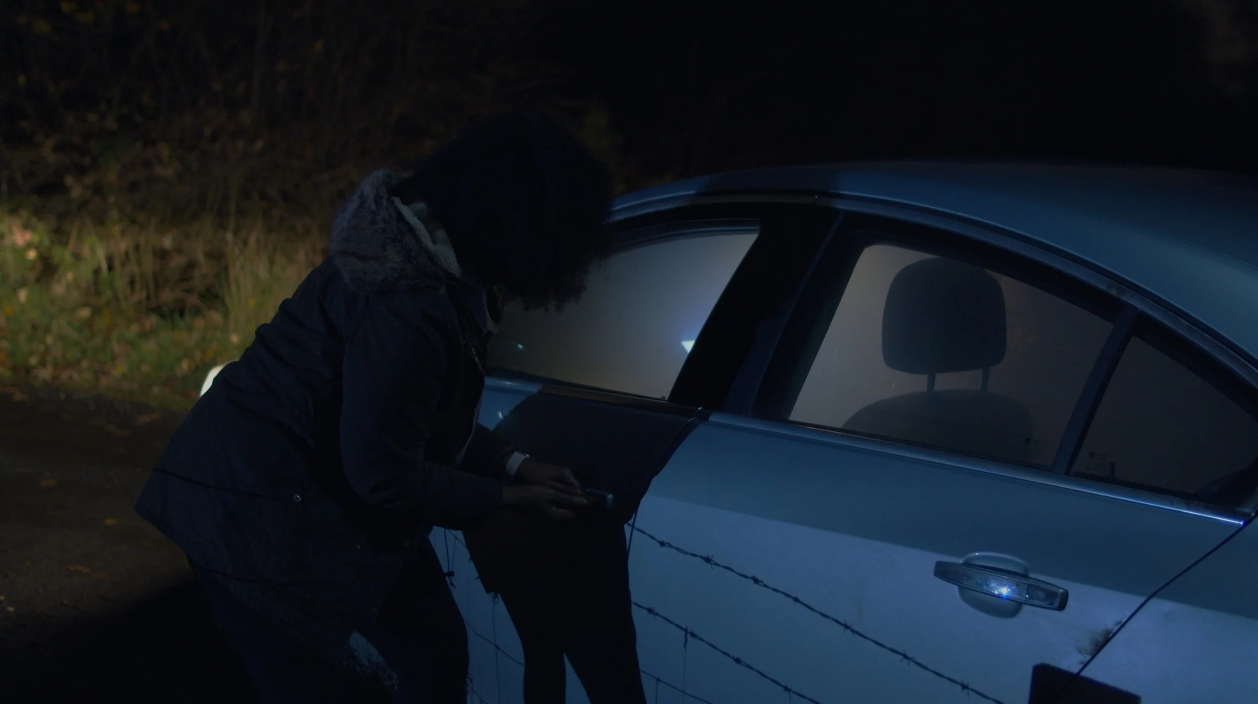
Colour grading determines how your video feels. A bright, airy grade can make a scene feel hopeful and open, while darker tones add intensity and focus. The grade defines not just the look, but the tone your audience emotionally connects with.
This is especially crucial in storytelling-driven films and promotional content, where atmosphere can enhance or completely shift meaning. For example, a recruitment video might use soft lighting and warm tones to evoke inspiration and belonging.
For businesses seeking corporate video production in Scotland, grading isn’t a luxury, it’s a creative decision that ensures tone aligns perfectly with purpose, message, and audience emotion.
Cultural and Contextual Meanings of Colour
Colours can hold different meanings depending on culture and context. Red may signify passion in one setting, but caution or luck in another. Being aware of these nuances ensures your message translates effectively across audiences.
In international campaigns or global corporate communications, this sensitivity to colour psychology helps avoid mixed signals and enhances inclusivity. It shows attention to detail and cultural understanding, both key to building trust.
A thoughtful approach to colour grading ensures visuals resonate universally without losing authenticity. Learn more about how Reverie approaches storytelling with cultural and emotional awareness on our about page.
Consistency Across Platforms
In today’s multi-platform world, your video will be viewed on everything from cinema screens to mobile phones. Consistent colour grading ensures your brand looks cohesive across all devices and lighting environments.
This means careful calibration and testing throughout the editing process. Without it, colours can shift or lose their intended emotion depending on where the video plays. Consistency keeps your visuals recognisable and your tone intact.
For brands using social media video production, consistent grading also helps audiences identify your content instantly, building familiarity and reinforcing your visual identity across channels, campaigns, and time.
Conclusion
Colour grading is the emotional thread that weaves a video together. It shapes perception, builds identity, and amplifies storytelling power. By understanding how colour affects emotion, brands can use it as a deliberate creative tool rather than an afterthought. For businesses seeking meaningful, visually cohesive storytelling in Glasgow and across Scotland, professional colour work can transform good footage into something unforgettable.
At Reverie Films, every grade serves a purpose, to make people feel. Ready to bring emotion and intention to your visuals? Contact us today to start your next project.